

The Shape of Experience (#20)
Quiet Influence of Structure


At a restaurant, you sit down and flip open the menu.
The paper is heavy cream stock edged in gold trim. Appetizers, entrées, and desserts are neatly grouped, each set in a clean serif font. Nothing feels out of place. It all feels natural. The menu promises an experience filled with class, quality, and order.
But imagine the same kitchen presenting the same dishes in a different way. There is no cardstock, no gold trim, no tidy rows. Instead, an A-frame stands near the bar, streaked with the dusty residue of chalk. Dishes appear in white handwriting with three already crossed out in red. The whole thing feels temporary, improvised, and alive.
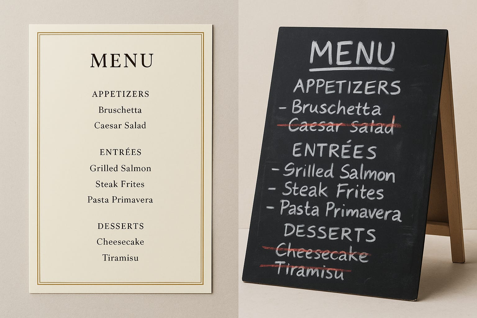
The food has not changed. The structure that delivers it has.
That shift in mood has nothing to do with recipes or ingredients. It comes entirely from the way the choices are arranged in front of you. One structure puts you at ease, another keeps you on your toes, and neither needs to announce itself for you to feel the difference.
Writing works the same way. You can present the same ideas with the same care, but the form you choose shapes what the reader experiences. Sometimes the structure invites them in with clarity. Other times it unsettles them, pulling them into dissonance they can’t quite name.
The difference becomes clearer when you look at the common forms we rely on every day.
Cues Beneath the Form
Think about the kinds of structures we use every day. A checklist template doesn’t just organize steps. It tells the reader this is something they can complete quickly, that progress is visible and measurable. A case study template doesn’t just hold a story. It signals proof, a narrative arc with a problem, a solution, and a victory at the end. A troubleshooting guide doesn’t just list solutions. It creates the sense that recovery is possible, that a path forward exists even when something is broken.
None of this happens by accident. The template is already whispering cues about how to read, what to expect, and how to feel while moving through the material. Most readers never notice it. They just register whether the experience felt clean and clarifying, or confusing and off-key.
However, when the cues are mismatched, the same template that creates clarity can just as easily create confusion.
Trapped in the Wrong Template
Sometimes the failure isn’t an empty section. It’s the right content trapped inside the wrong form.
Imagine trying to explain a multi-step installation process inside a checklist template. The boxes invite someone to race through without pausing, when what they actually need is context, sequencing, and pacing. Or picture a troubleshooting template pressed into service for prerequisites. Instead of feeling prepared, the reader feels like they’ve already broken something. Think about narrative prose used to describe an API route, its parameters, and its responses. What should be crisp, glanceable, and precise turns into a wall of words no one can hold in working memory.
The material might be accurate, even thoughtful. But the template bends it into the wrong shape, and the reader walks away with the wrong experience.
Quiet Precision of Fit
When the structure fits, you hardly notice it at all.
The checklist that guides someone through a series of small, sequential steps becomes almost addictive — each box ticked off, momentum carrying them forward. The troubleshooting guide that stays tightly focused on failure paths gives the reader confidence that no dead end is permanent. The terse table that lays out an API route with its request and response parameters doesn’t draw attention to itself; it simply makes the complex glanceable, the invisible visible.
In each case, the template fades. What remains is the experience: confidence, momentum, relief. The reader doesn’t think, That was a great checklist. They think, I know what to do next.
That kind of fit doesn’t happen by accident. It comes from treating templates less like static forms and more like instruments. A few principles help:
Let the content choose the frame. A template should amplify the nature of the material — quick steps into a checklist, complex recovery into a troubleshooting flow, structured data into a table. Don’t force-fit.
Keep the spirit, not the letter. Use the template to capture intent, but be willing to bend its format when the reader’s need demands it.
Cut the ornamental sections. If a field exists only because the template requires it, remove it. Blank boxes signal bureaucracy, not clarity.
Match the mood. Ask what you want the reader to feel — confident, prepared, reassured, curious — and pick the structure that best delivers that mood.
Evolve the form. Templates are not sacred. When you see readers consistently struggling or skipping, let the template mutate. The best ones improve with every use.
Experience that Endures
That’s the quiet art of templates. They aren’t there to be admired. They’re there to vanish, to hold the shape of an experience so the content can do its work.
Just like a menu. Heavy cream stock and gold trim create one kind of dinner. A smudged A-frame board creates another. Neither is right or wrong on its own; each succeeds only when it matches the food being served and the mood being set.
Writing is no different. Your reader will never thank you for the template you chose, but they will remember how the experience felt: ordered or chaotic, clear or confusing, effortless or strained.
The food stays the same. The structure decides the meal.